Xplot is general package for creating X-Y graphics which also allows sophisticated data visualization, processing, manipulation and analysis. It is part of the XOP package. It is fully interactive, permitting also a large number of manipulation and presentation of the data.
Few of its capabilities are summarized here:
Direct loading of data from multicolumn ASCII data files. Access and merge multiple sets of data.
Access to SPEC data files.
Direct printing from workstations and PCs. PostScript and Encapsulated PostScript outputs.
Linear and logarithmic X- and Y-axes.
Apply and change symbols, line styles, colors, thickness, fonts, etc.
Label, annotate, add legends, titles, etc. to the plots.
Zoom, shift, switch columns, and over-plot data.
Save and restore plots and attributes in a XPLOT backup file.
Data analysis: extrema, moments, integrals, derivatives, CDFs, smoothing, user-defined operations, interactive Fourier Filtering, interpolations, convolutions and correlations.
Fitting: linear regression, polynomial fit, Gaussian fit
Xplot is also used together other XOP applications:
EXODUS: for manipulating datasets
FuFiFa: Non linear fitting
These features will be discussed in more detail later
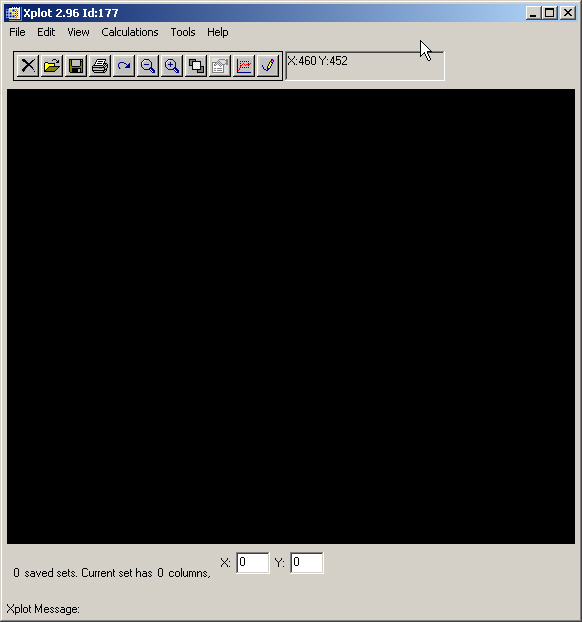
There are several ways to start Xplot. One of them is to start Xplot from the Xop main window: go to Tools menu and select Xplot (Plotting tool). Other typical ways are:
from applications inside Xop
from Start->Xop->Xplot menu under Windows
entering ”r;xop xplot” at the command prompt under Unix
A new window like this one appears:
The different areas in this window are:
Menu bar: Contains the menus to access all the features in Xplot
Control buttons: Used to invoke the most commonly used functions
Drawing area: The zone where your graph will appear
Displayed X and Y columns: The X and Y data displayed in the Drawing area are two columns from a multicolumn table called ”r;data set”.
Info message: You can read here some on-going information from Xplot
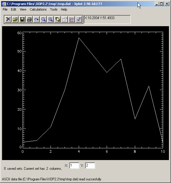
Create or locate a file with the data you want to plot. For example, write a file called tmp.dat with your favorite editor, or with the Xop file editor available in Xop->Tools->File editor&ldots; I entered the following data in two columns, using a simple blank character as a separator. Note that I also wrote a comment section. You can write any text as comment. Xplot will ignore it.
Important: if you are creating an ASCII data file, do not user the dash (#) symbol for starting the
comment. This is the standard header symbol for SPEC files and Xplot will get confused.
; this is a comment:
; example of data to test Xplot
0 3
1 4
2 11
3 30
4 57
5 48
6 39
7 46
8 15
9 32
10 3
Now your can use Xplot->File->Load Data File&ldots; to get the data in Xplot. Now your Xplot window looks like this:
You can:
See data numerical values using Xplot->View->Show Data
Edit some numbers using Xplot->Edit->Data
Save numerical data to a file using Xplot->File->Write ASCII file with current set&ldots;
Print it using: File->Print Plot&ldots;
You may notice that when you move the mouse on the display, you get
the coordinates in the top of the window. You are now invited to press
the  button, and you will get an additional window with several controls.
Play a little with the controls and you will be able to change the plotting symbol, the line style, display the data in logarithmic scale, change font, thickness, character size, and colors. The default color table is just black and white. If your started Xplot from the Xop window, you see at the bottom of the color table some
predefined useful colors. Click on one of these colors to change, for example, the lines color. If clicking is difficult, just enter the cumber of the color (between 0 and 31) and validate with <enter>. You can scan colors using the ”r;>>” or ”r;<<” buttons.
For playing with colors, you may want to load a nicer color table by using the Change color table button. This button pops-up a new window, click for example the line 16 LEVEL and then the button done. You will see that a multicolored table appears in the bottom of the Xplot controls window. Now click in the desired color for selecting your background, line and axis colors. For example, after few manipulation and adding titles with Xplot->Edit->Titles and you can get something like:

One of the most important features of Xplot is the capability to display multi-line graphs with data coming from different origins. Data in Xplot is structured in the so-called sets.
A set is an array or matrix containing N points (or rows) and M columns.
A typical X/Y plot data as described in the tmp.dat file is a set with 11 points and two columns, the first one for the X points and the second one for Y. Xplot stores the data in multiple sets, and each set may hold a different number of points or columns. Xplot allows multi-line plots, in which the data for each line is a couple of columns from a given set.
Xplot options Calculations and File->Load Data File... allows to create new columns in defined sets and new sets from files or from operations between existing sets.
You can change the X and Y columns for the plot in the current set of data by just typing the column numbers in the bottom of the Xplot window:
Try for example to write a 1 in the Y column, then type <Enter> and you will see in your display a straight line, in other words the first column of the set plotted against itself. You can invert the X and one axis by typing 2 and 1 in the X and Y columns, respectively.
It is very important to type <Enter> after modifying any text widget in Xplot. That permits Xplot to understand you have finished with the editing, and process the event.
You can connect and disconnect the plot symbols with lines by using
the first control in the Xplot Controls window .
But it is also possible to do it by overplotting twice the same data points, the first plot points are connected with solid line, and the second plot uses disconnected symbols. This is, for example, the only way to display the line with a given color (i.e. red) and the symbols with another one (i.e. green). We are going to do that to
learn an important feature of Xplot, the possibility of creating multi-line plots.
Follow the next steps:
Display your points with Symbol Connection: Connected and
Plot Symbol: 0:Line (Xplot defaults).
Color the lines in Red (using color index 2 if you started Xplot from Xop).
Change if you want the thickness to a thicker value (i.e. 3).
Press the button  "save plot (for overplotting)".
You may notice that nothing happened, but in fact, if you see at the Xplot
message at the bottom of the Xplot window, you can read that ”r;Current
set saved ...”. You have now two lines on your display, but as both
are the same data with the same attributes, they look like a single one.
"save plot (for overplotting)".
You may notice that nothing happened, but in fact, if you see at the Xplot
message at the bottom of the Xplot window, you can read that ”r;Current
set saved ...”. You have now two lines on your display, but as both
are the same data with the same attributes, they look like a single one.
From the Xplot controls window, change the Plot Symbol to, for example, 6: Square, change the Symbol connection to Disconnected, and change also the Line/Symbol thickness to 10 (for doing that, you can use the slider, or directly enter an 10 plus <Enter> in the text widget on the top of the slider). Select now in the Lines color blue (index 4). You will see the square symbol points (current set) and an overplotted red line which is the saved set. Now, controls apply to the current set of data, and the saved set’s attributes are not affected by controls.
The current set can be overwritten by using the File/Load Data File... option. This option allows to load a set in a multi column ASCII file to the current set, without affecting the saved sets. The ASCII multicolumn file can also contain any number of text lines, which are interpreted as comments and ignored by Xplot
Thus, by using the Save Current button, one may build complicated multiline plots, with data coming from one or different files.
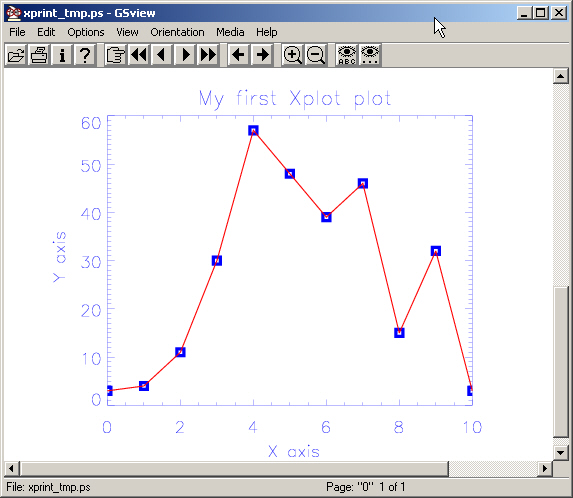
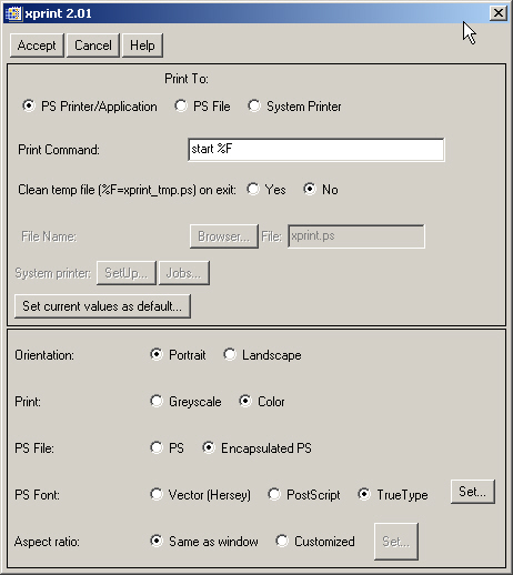
You can print the result. Often, you do not want to print, but to use
the graph in a paper or other document. Here, you need the maximum of
resolution and a bitmap (screen capture) is not desirable. I usually print
to en encapsulated PostScript file and import it in Word. Using the print
button  and the setting (note that the created file is not cleaned):
I sent the postscript output to my ps viewer (which must be installed):